はじめに
例えば
classStore{publicstringName{get;set;}publicstringPrefecture{get;set;}publicintFavoriteCount{get;set;}}このようなクラスの Listを画面上に表示し、一覧画面を作成したいというようなケースは多々あるかと思います。
言語によってはView上で forを使用しListをループすることで実現可能だったりしますが
残念ながらWPFではそのような方法では実現できません。
そこで登場するのがItemControlクラスです。
ItemsControlクラスはコレクションを並べて表示することができ、上記のようなことを実現するにはもってこいのクラスです。
また派生クラスにはListBoxクラスやComboBoxクラスなどがあり、UIのカスタマイズなどを行うことができるようになっています。
非常に柔軟性が高く、お世話になる機会も多いだろうと思い、ItemsControlクラス(とその派生クラス)の基本的な使い方を整理していきます。
ソースコードについて
今回はMVVMでいうところのViewModelは以下を使用します。
namespaceItemsControl.ViewModels{classMainViewModel{publicMainViewModel(){this.Mall=Enumerable.Range(120).Select(x=>newStore(){Name="お店"+x,Prefecture="東京都",FavoriteCount=x*10,}).ToList();}publicList<Store>Mall{get;set;}}}またModelとして前述のStoreクラスを使用しています。
ItemsControlでカスタマイズできること
ItemsControlでは4つのプロパティが用意されており、それらを設定することでカスタマイズしています。
| プロパティ名 | 概要 | 設定で使用するコントロール |
|---|---|---|
| Template | ItemsControlそのものを指定します。 | ControlTemplate |
| ItemsPanel | 要素の並べ方について指定します。 | ItemsPanaleTemplate |
| ItemTemplate | 要素を表示する際のテンプレートを指定します。 | DataTemplate |
| ItemContainierStyle | 要素に適応するStyleを指定します。 | Style |
それぞれの持ち場を図にするとこんな感じです。
ではそれぞれ見ていきます。
Template
ControlTemplateを指定することで、コントロール全体の設定を行うことが多いです。
<ListBoxItemsSource="{Binding Mall}"><ListBox.Template><ControlTemplateTargetType="{x:Type ListBox}"><BorderBorderThickness="5"BorderBrush="Red"Background="LightGray"><ItemsPresenterMargin="5"/></Border></ControlTemplate></ListBox.Template></ListBox>表示するとこんな感じ。
見るとわかる通り、表示されているのはListに格納されているオブジェクトの名前になっています。
これはそのオブジェクト(今回の場合は Storeクラス)に toString()が実装されていないためです。
なので toString()を実装してあげればこのままでもデータを表示することは可能です。
namespaceItemsControl.ViewModels{classMainViewModel{publicMainViewModel(){this.Mall=Enumerable.Range(120).Select(x=>newStore(){Name="お店"+x,Prefecture="東京都",FavoriteCount=x*10,}).ToList();}publicList<Store>Mall{get;set;}publicoverridestringToString(){returnthis.Name;}}}
ItemsPanel
ItemsPanelTemplateでコレクションをどう並べるかを指定します。
指定できるのはPanelクラスの派生クラスである以下の3つです。
なお、デフォルトで StackPanelが指定されているので、何も指定されていない場合は要素が縦に並びます。
| クラス名 | 配置 |
|---|---|
| StacPanel | 縦に並ぶ |
| WrapPanel | 横に並ぶ |
| Grid | 指定はできるが子要素を並べる機能がないためすべて重なる |
<ListBoxItemsSource="{Binding Mall}"><ListBox.ItemsPanel><ItemsPanelTemplate><WrapPanelOrientation="Horizontal"/></ItemsPanelTemplate></ListBox.ItemsPanel></ListBox>表示するとこんな感じ。
ちなみにGridで表示すると以下のようにすべての要素が重なります。
これ、どういうときに使うんだろうか...
ItemTemplate
DataTemplateでコレクションの項目をどのように表示するかを指定します。
要は、各要素単位での表示設定です。
<ListBoxItemsSource="{Binding Mall}"><ListBox.ItemTemplate><DataTemplate><StackPanel><TextBlock><TextBlock.Text><MultiBindingStringFormat="【{0}】{1}"><BindingPath="Prefecture"/><BindingPath="Name"/></MultiBinding></TextBlock.Text></TextBlock><TextBlockText="{Binding FavoriteCount, StringFormat=お気に入り:{0}}"/></StackPanel></DataTemplate></ListBox.ItemTemplate></ListBox>表示するとこんな感じ。
ItemContainerStyle
Styleを指定します。ItemTemplateと同じく要素ごとの表示方法を指定するプロパティです。
要は、WebページでいうところのCSSです。
<ListBoxItemsSource="{Binding Mall}"><ListBox.ItemContainerStyle><StyleTargetType="ListBoxItem"><SetterProperty="OverridesDefaultStyle"Value="True"/><SetterProperty="Template"><Setter.Value><ControlTemplateTargetType="{x:Type ContentControl}"><BorderBackground="{TemplateBinding Background}"><ContentPresenter/></Border></ControlTemplate></Setter.Value></Setter><Style.Triggers><TriggerProperty="IsMouseOver"Value="True"><SetterProperty="Background"Value="LightBlue"/></Trigger><TriggerProperty="IsSelected"Value="True"><SetterProperty="Background"Value="LightGreen"/></Trigger></Style.Triggers></Style></ListBox.ItemContainerStyle></ListBox>表示するとこんな感じ。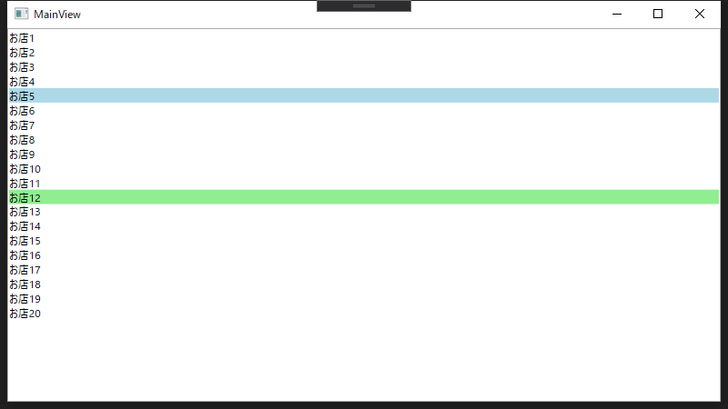
Triggerでは、特定の動作に連動させてStyleを変更することができます。
上記コードだと
- マウスオーバーで要素の背景をLightBlueに
- 選択した要素の背景をLightGreenに
という2点を対応しています。
最終的にできたもの
ここまで整理してきた4つのプロパティをすべて合わせたものがこちらです。
※見栄えを整えるために ItemContainerStyleに一部Styleを追加しています
<ListBoxItemsSource="{Binding Mall}"><ListBox.Template><ControlTemplateTargetType="{x:Type ListBox}"><BorderBorderThickness="5"BorderBrush="Red"Background="LightGray"><ItemsPresenterMargin="5"/></Border></ControlTemplate></ListBox.Template><ListBox.ItemsPanel><ItemsPanelTemplate><WrapPanelOrientation="Horizontal"/></ItemsPanelTemplate></ListBox.ItemsPanel><ListBox.ItemTemplate><DataTemplate><StackPanel><TextBlock><TextBlock.Text><MultiBindingStringFormat="【{0}】{1}"><BindingPath="Prefecture"/><BindingPath="Name"/></MultiBinding></TextBlock.Text></TextBlock><TextBlockText="{Binding FavoriteCount, StringFormat=お気に入り:{0}}"/></StackPanel></DataTemplate></ListBox.ItemTemplate><ListBox.ItemContainerStyle><StyleTargetType="ListBoxItem"><SetterProperty="OverridesDefaultStyle"Value="True"/><SetterProperty="Template"><Setter.Value><ControlTemplateTargetType="{x:Type ContentControl}"><BorderBackground="{TemplateBinding Background}"><ContentPresenter/></Border></ControlTemplate></Setter.Value></Setter><SetterProperty="Margin"Value="10"/><!-- 追加したStykle その1 --><SetterProperty="Width"Value="100"/><!-- 追加したStykle その2 --><SetterProperty="Height"Value="50"/><!-- 追加したStykle その3 --><Style.Triggers><TriggerProperty="IsMouseOver"Value="True"><SetterProperty="Background"Value="LightBlue"/></Trigger><TriggerProperty="IsSelected"Value="True"><SetterProperty="Background"Value="LightGreen"/></Trigger></Style.Triggers></Style></ListBox.ItemContainerStyle></ListBox>
まとめ
ItemsControlでコントロールの外見を変更する方法を整理しました。
変更のためには4つのパラメーターを変更していきます。
一覧系の画面や選択肢を列挙など、使用用途は幅広くお世話になることも多いかと思います。
なお、今回はListBoxを使用しましたが、基本的な考え方はComboBoxも同じなので流用できるはずです。