■はじめに
.NET Core 3.1とVisual Studioでコントロールの見栄えを変えたり標準以外のコントロールを使ってみます。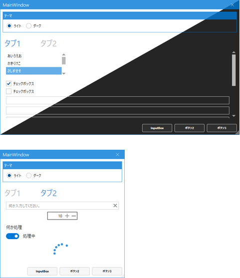
キーワード:ライト/ダークテーマ, NumericUpDown, プログレスリング, ウォーターマーク, トグルスイッチ, InputBox
■環境
- Windows 10
- Visual Studio 2019 Version 16.7.4
- .NET Core 3.1
- MahApps.Metro 2.2.0
■ベース画面作成
こちらを参考に「準備」と「プロジェクトの作成」をしてください。
プロジェクト名はWpfAppThemeSampleにしました。
そして画面を以下のように作成します。
<Windowx:Class="WpfAppThemeSample.MainWindow"xmlns="http://schemas.microsoft.com/winfx/2006/xaml/presentation"xmlns:x="http://schemas.microsoft.com/winfx/2006/xaml"xmlns:d="http://schemas.microsoft.com/expression/blend/2008"xmlns:local="clr-namespace:WpfAppThemeSample"xmlns:mc="http://schemas.openxmlformats.org/markup-compatibility/2006"Title="MainWindow"Width="800"Height="450"mc:Ignorable="d"><Window.Resources><!-- タブの既定スタイル --><StyleTargetType="TabItem"><SetterProperty="Width"Value="120"/></Style><!-- ボタンの既定スタイル --><StyleTargetType="Button"><SetterProperty="Margin"Value="8,8,8,0"/></Style><!-- 画面下部のボタンスタイル --><Stylex:Key="FooterButton"TargetType="Button"><SetterProperty="Width"Value="100"/><SetterProperty="Margin"Value="8,0,0,0"/></Style><!-- テキストボックスの既定スタイル --><StyleTargetType="TextBox"><SetterProperty="Margin"Value="8,8,8,0"/></Style></Window.Resources><Grid><Grid.RowDefinitions><RowDefinitionHeight="Auto"/><RowDefinition/><RowDefinitionHeight="Auto"/></Grid.RowDefinitions><!-- テーマ切り替え --><GroupBoxMargin="8"Header="テーマ"><StackPanelOrientation="Horizontal"><RadioButtonMargin="8"Content="ライト"IsChecked="True"/><RadioButtonMargin="8"Content="ダーク"/></StackPanel></GroupBox><TabControlGrid.Row="1"Margin="8"><!--#region ■タブ1--><TabItemHeader="タブ1"IsSelected="True"><ScrollViewer><StackPanel><ListBoxWidth="200"Height="80"Margin="8"HorizontalAlignment="Left"SelectedIndex="2"><ListBoxItemContent="あいうえお"/><ListBoxItemContent="かきくけこ"/><ListBoxItemContent="さしすせそ"/><ListBoxItemContent="たちつてと"/><ListBoxItemContent="なにぬねの"/><ListBoxItemContent="はひふへほ"/></ListBox><CheckBoxMargin="8,8,8,0"Content="チェックボックス"IsChecked="True"/><CheckBoxMargin="8,8,8,0"Content="チェックボックス"/><TextBoxText=""/><TextBoxText=""/><ButtonContent="ボタン"/><ButtonContent="ボタン"/><ButtonContent="ボタン"/><ButtonContent="ボタン"/><ButtonContent="ボタン"/><ButtonContent="ボタン"/></StackPanel></ScrollViewer></TabItem><!--#endregion--><!--#region ■タブ2--><TabItemHeader="タブ2"><StackPanel><TextBox/></StackPanel></TabItem><!--#endregion--></TabControl><StackPanelGrid.Row="2"Margin="8"HorizontalAlignment="Right"Orientation="Horizontal"><ButtonContent="InputBox"Style="{StaticResource FooterButton}"/><ButtonContent="ボタン2"Style="{StaticResource FooterButton}"/><ButtonContent="ボタン3"Style="{StaticResource FooterButton}"/></StackPanel></Grid></Window>実行してみます。
■デザインの変更
◇ライブラリのインストール
ソリューションエクスプローラーでプロジェクトを右クリック、メニューからNuGetパッケージの管理を選択します。
参照タブの検索ボックスにmetroと入力し、MahApps.Metroをインストールします。
◇App.xamlの修正
ResourceDictionaryを追加します。
<Applicationx:Class="WpfAppThemeSample.App"xmlns="http://schemas.microsoft.com/winfx/2006/xaml/presentation"xmlns:x="http://schemas.microsoft.com/winfx/2006/xaml"xmlns:local="clr-namespace:WpfAppThemeSample"StartupUri="MainWindow.xaml"><Application.Resources><ResourceDictionary><ResourceDictionary.MergedDictionaries><ResourceDictionarySource="pack://application:,,,/MahApps.Metro;component/Styles/Controls.xaml"/><ResourceDictionarySource="pack://application:,,,/MahApps.Metro;component/Styles/Fonts.xaml"/><ResourceDictionarySource="pack://application:,,,/MahApps.Metro;component/Styles/Themes/Light.Blue.xaml"/></ResourceDictionary.MergedDictionaries></ResourceDictionary></Application.Resources></Application>◇MainWindow.xamlの修正
Windowをmah:MetroWindowに変更し、xmlns:mah="http://metro.mahapps.com/winfx/xaml/controls"を追加します。
<Windowx:Class="WpfAppThemeSample.MainWindow"xmlns="http://schemas.microsoft.com/winfx/2006/xaml/presentation"xmlns:x="http://schemas.microsoft.com/winfx/2006/xaml"xmlns:d="http://schemas.microsoft.com/expression/blend/2008"xmlns:local="clr-namespace:WpfAppThemeSample"xmlns:mc="http://schemas.openxmlformats.org/markup-compatibility/2006"Title="MainWindow"Width="800"Height="450"mc:Ignorable="d"><mah:MetroWindowx:Class="WpfAppThemeSample.MainWindow"xmlns="http://schemas.microsoft.com/winfx/2006/xaml/presentation"xmlns:x="http://schemas.microsoft.com/winfx/2006/xaml"xmlns:d="http://schemas.microsoft.com/expression/blend/2008"xmlns:local="clr-namespace:WpfAppThemeSample"xmlns:mc="http://schemas.openxmlformats.org/markup-compatibility/2006"xmlns:mah="http://metro.mahapps.com/winfx/xaml/controls"Title="MainWindow"Width="800"Height="450"mc:Ignorable="d">スタイル定義にBasedOnを追加します。
<!-- タブの既定スタイル --><StyleBasedOn="{StaticResource MahApps.Styles.TabItem}"TargetType="TabItem"><SetterProperty="Width"Value="120"/></Style><!-- ボタンの既定スタイル --><StyleBasedOn="{StaticResource MahApps.Styles.Button}"TargetType="Button"><SetterProperty="Margin"Value="8,8,8,0"/></Style><!-- 画面下部のボタンスタイル --><Stylex:Key="FooterButton"BasedOn="{StaticResource MahApps.Styles.Button}"TargetType="Button"><SetterProperty="Width"Value="100"/><SetterProperty="Margin"Value="8,0,0,0"/></Style><!-- テキストボックスの既定スタイル --><StyleBasedOn="{StaticResource MahApps.Styles.TextBox}"TargetType="TextBox"><SetterProperty="Margin"Value="8,8,8,0"/></Style>◇MainWindow.xaml.csの修正
MainWindow.xaml.csファイルを開き、継承元の記述を消します。
publicpartialclassMainWindow:WindowpublicpartialclassMainWindow実行してみます。
デザインが変わりました。
■大文字小文字
タイトルバーのMainWindowと下部ボタンのInputBoxが勝手に大文字に変えられています。
これを無効にして元々設定されたテキストの通りに表示するようにします。
mah:MetroWindowにTitleCharacterCasing="Normal"を追加します。FooterButtonのスタイル定義に<Setter Property="mah:ControlsHelper.ContentCharacterCasing" Value="Normal" />を追加します。
■ウィンドウスタイル設定(最大化ボタン、最小化ボタン)
mah:MetroWindowにResizeMode="CanResizeWithGrip"(サイズ変更グリップ表示)、ShowMaxRestoreButton="False"(最大化ボタン非表示)、ShowMinButton="False"(最小化ボタン非表示)を追加します。
ここまででXamlは以下のようになっています。
<mah:MetroWindowx:Class="WpfAppThemeSample.MainWindow"xmlns="http://schemas.microsoft.com/winfx/2006/xaml/presentation"xmlns:x="http://schemas.microsoft.com/winfx/2006/xaml"xmlns:d="http://schemas.microsoft.com/expression/blend/2008"xmlns:local="clr-namespace:WpfAppThemeSample"xmlns:mah="http://metro.mahapps.com/winfx/xaml/controls"xmlns:mc="http://schemas.openxmlformats.org/markup-compatibility/2006"Title="MainWindow"Width="800"Height="450"ResizeMode="CanResizeWithGrip"ShowMaxRestoreButton="False"ShowMinButton="False"TitleCharacterCasing="Normal"mc:Ignorable="d"><!-- 画面下部のボタンスタイル --><Stylex:Key="FooterButton"BasedOn="{StaticResource MahApps.Styles.Button}"TargetType="Button"><SetterProperty="Width"Value="100"/><SetterProperty="Margin"Value="8,0,0,0"/><SetterProperty="mah:ControlsHelper.ContentCharacterCasing"Value="Normal"/></Style>実行してみます。
タイトルバーとボタンの英字がちゃんと指定された通り、大文字小文字が区別されて表示されました。
最小化ボタンと最大化ボタンも消えました。
ウィンドウの右下にサイズ変更がしやすいようにグリップが表示されました。
■ダークテーマ
現在のライトテーマと、ダークテーマを切り替えられるようにします。
2つのラジオボタンにCheckedイベントの処理を設定します。
<!-- テーマ切り替え --><GroupBoxMargin="8"Header="テーマ"><StackPanelOrientation="Horizontal"><RadioButtonMargin="8"Checked="ThemeRadioButton_Checked"Content="ライト"IsChecked="True"/><RadioButtonMargin="8"Checked="ThemeRadioButton_Checked"Content="ダーク"/></StackPanel></GroupBox>usingControlzEx.Theming;usingSystem.Windows;usingSystem.Windows.Controls;namespaceWpfAppThemeSample{/// <summary>/// Interaction logic for MainWindow.xaml/// </summary>publicpartialclassMainWindow{publicMainWindow(){InitializeComponent();}privatevoidThemeRadioButton_Checked(objectsender,RoutedEventArgse){if(((RadioButton)sender).Content.ToString()=="ライト"){// ライトテーマを設定ThemeManager.Current.ChangeTheme(this,"Light.Blue");}else{// ダークテーマを設定ThemeManager.Current.ChangeTheme(this,"Dark.Blue");}}}}実行してみます。ダークのラジオボタンを選択すると黒ベースの配色になりました。
■ウォーターマーク
テキストボックス未入力時に薄字で文字を表示します。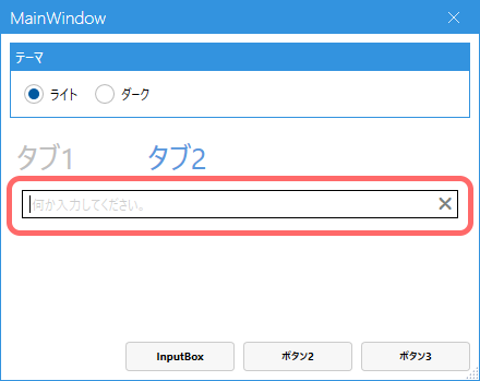
タブ2に配置していたテキストボックスを修正します。mah:TextBoxHelper.Watermarkに設定した文字列が、テキストボックス空欄時に薄字で表示されます。
ついでにmah:TextBoxHelper.ClearTextButton="True"でテキスト内容をクリアする×ボタンが表示されます。
<TabItemHeader="タブ2"><StackPanel><TextBoxmah:TextBoxHelper.ClearTextButton="True"mah:TextBoxHelper.Watermark="何か入力してください。"Text=""/></StackPanel></TabItem>■NumericUpDown
数値入力に適したテキストボックスです。
直接入力することも、+, -ボタンで数値を増減することもできます。
タブ2の中のStackPanelに以下を追加します。
<mah:NumericUpDownWidth="100"Margin="8"Maximum="999"Minimum="1"Value="10"/>■トグルスイッチ
On/Offするスイッチです。
タブ2のStackPanelに追加します。
<mah:ToggleSwitchMargin="8"Header="何か処理"IsOn="False"OffContent="停止"OnContent="処理中"Toggled="ToggleSwitch_Toggled"/>privatevoidToggleSwitch_Toggled(objectsender,RoutedEventArgse){}■プログレスリング
処理中表示に使う、●がぐるぐる回るやつです。
タブ2のStackPanelに追加します。
<mah:ProgressRingx:Name="ProgressR"IsActive="False"/>トグルスイッチ切り替え時の処理を記述します。
トグルスイッチがOnになったら処理中表示にするようにします。
privatevoidToggleSwitch_Toggled(objectsender,RoutedEventArgse){ProgressR.IsActive=((MahApps.Metro.Controls.ToggleSwitch)sender).IsOn;}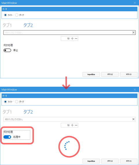
■InputBox
文字入力するためのポップアップ画面です。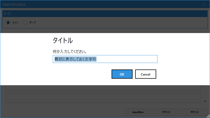
InputBoxボタンにClickイベントの処理を追加します。
<ButtonClick="InputBoxButton_Click"Content="InputBox"Style="{StaticResource FooterButton}"/><ButtonContent="ボタン2"Style="{StaticResource FooterButton}"/><ButtonContent="ボタン3"Style="{StaticResource FooterButton}"/>MahApps.Metro.Controls.Dialogsをusingしておきます。InputBoxButton_Click定義にasyncを付け足してください。ShowInputAsyncでInputBoxを表示します。
usingMahApps.Metro.Controls.Dialogs;:privateasyncvoidInputBoxButton_Click(objectsender,RoutedEventArgse){varsettings=newMetroDialogSettings(){DefaultText="最初に表示しておく文字列"};stringresult=awaitthis.ShowInputAsync("タイトル","何か入力してください。",settings);if(result==null){// キャンセルreturn;}else{awaitthis.ShowMessageAsync("タイトル",$"「{result}」が入力されました。");}}■タブ切り替え時にアニメーション
TabControlをmah:MetroAnimatedTabControlに変更するとタブ切り替え時に中身がスライドして表示されるようになります。
<TabControlGrid.Row="1"Margin="8"><mah:MetroAnimatedTabControlGrid.Row="1"Margin="8">